BIAT
Sep 30, 2026
This is a concept for the first minute of MyBIAT, the banking app of Banque Internationale Arabe de Tunisie. I made it on my own; the bank didn't commission it. It's all SwiftUI with no packages, no Lottie and no After Effects, so every frame is drawn by the app itself. It plays like a short film in three scenes: the bank's dancer drawing herself into the logo, a passcode screen, and an intro to the bank. Part of the point was to see how far plain native code could go.
Three scenes, nothing else
I kept only the parts that move: three scenes with one shared visual language. Each one can start on its own and loop, which made them much easier to tune separately. When the app plays itself, the passcode is typed at an uneven pace, because a perfectly even rhythm looks like a robot typing.
Everything draws itself
The whole look comes from one small building block. An outline is stroked on with trim, and then the colour floods in behind the line. The outline and the fill each get their own animation. When they shared one, SwiftUI blended them into a plain crossfade and the drawing effect was gone. The fill starts once the outline is 72% done, so the line always looks like it's leading.
The dancer comes from the bank's campaign photo. I separated it into eleven tone bands, traced them with potrace, and turned the result into about 7,000 curve segments of Swift path code. She draws herself band by band, and then the photo shows through the same shapes that drew her.
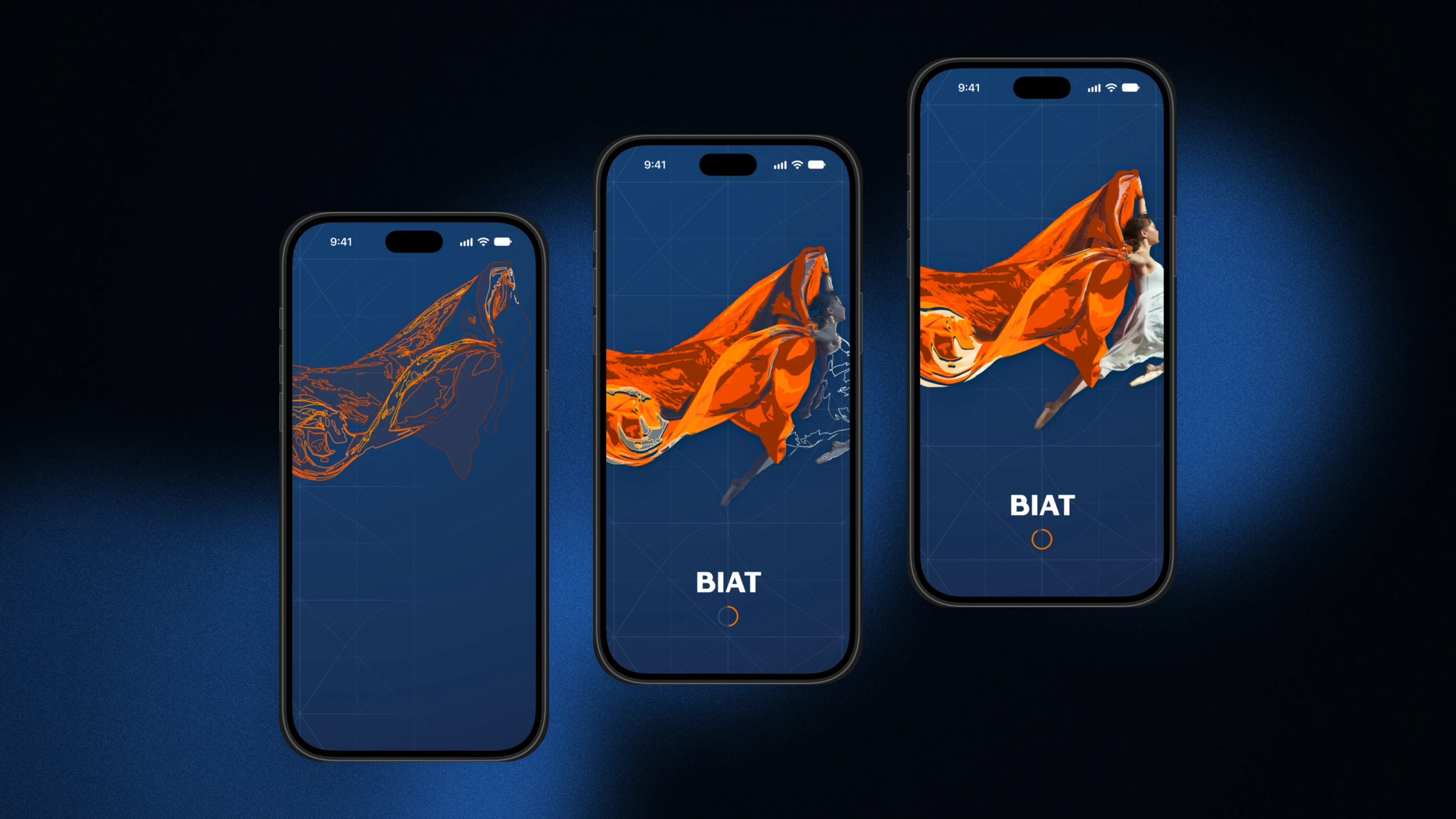
Cloth that becomes the logo
Her cape moves in the wind. Each point on its path moves along a sine wave, scaled by the square of its distance from the shoulder, so the top stays still and the loose corner flows. I couldn't use GeometryEffect for this because it only tilts or stretches a whole view, and that looks like a card swinging, not fabric.
At the end, a mask shaped like the bank's swoosh closes over her moving cloth and the real logo rises inside it. I first thought about morphing her into the logo, but going from 7,000 segments to 40 would have meant inventing matches between shapes that have nothing in common. The mask looks better and was far simpler.
One mark across every screen
The logo is drawn once and travels between screens. It flies from sign in to its spot above the keypad and back along the same path. A preference key tells it where to go next, so there's never a second copy. The interface uses iOS 26 Liquid Glass, Face ID uses the system sheet, and it runs in five languages through the system locale.
The motion has one rule: no bounce. Everything is eased, nothing is sprung. It's a bank, and a bank shouldn't bounce.
Coins and cards
The intro shows the bank's cards and a column of falling dinars. The coins are drawn with flat gradients instead of being rendered, and they leave by undrawing. Silk, coins and cards share one stepped colour ramp lit from the same angle, so they look like one set. Since it's all code, it stays sharp at any size.
Holding sixty frames a second
The opening first ran at 11 to 20 frames a second. I added a display link probe to measure frame times, then removed things one by one until I found it. The wind was redrawing every offscreen layer on every frame. Wrapping it in drawingGroup merged six offscreen passes into a single GPU pass, and it went to a steady 60.
Two smaller fixes kept it there. Slides hidden in the page view are paused instead of animating off screen. And the opening became tappable at 4.63 seconds instead of 5.53, so it doesn't make you wait.