Campusna
Jan 03, 2025
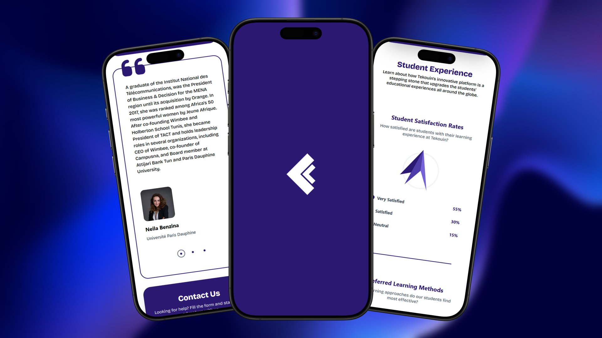
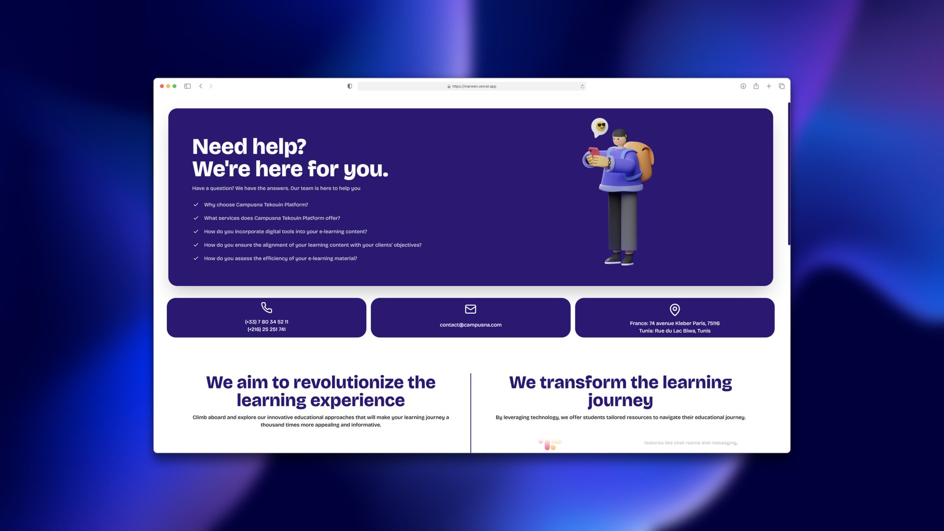
Campusna is an EdTech company working between Paris and Tunis. I designed and built the website for its learning platform, Tekouin, as a client project. Five pages that had to feel serious enough for universities and fun enough for students, with motion that gives it character without getting in the way. It's a static site on GitHub Pages, so there's no server to look after.
Visit the live site ↗An opening in the brand's colour
The site opens on the Campusna mark, animated with a GSAP timeline. It grows on an elastic ease, holds for a moment, then hands over to the page. A bit of bounce suits a student audience. Page changes use the same purple, with four columns sweeping across one after another, so every transition ties back to the brand.

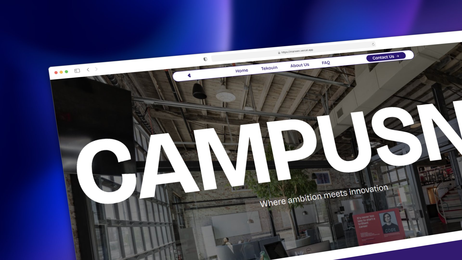
A hero that opens like a window
The hero starts as a thin line and opens upward with a clip-path on a custom ease I called hop. It starts fast and lands softly, which makes it feel like a reveal instead of a slide. The title rises letter by letter as it lands.
While it opens, the frame scales up and the photo inside scales down. The two cancel out, so the photo barely changes size on screen, and that's what makes it read as a camera pulling back.
Scroll that tells the story
The six services stack as sticky cards. Each card shrinks by 5% for every card stacked after it (1 − (n − i) × 0.05), so the earlier ones fold back like a deck, and each new image zooms from 2× down to its real size as it arrives. Both are tied to scroll progress.
Lenis keeps the scroll even. The navigation hides on the way down and comes back on the way up, which gives the content the full screen while you read. Key figures count up when they come into view.
Content the client could change
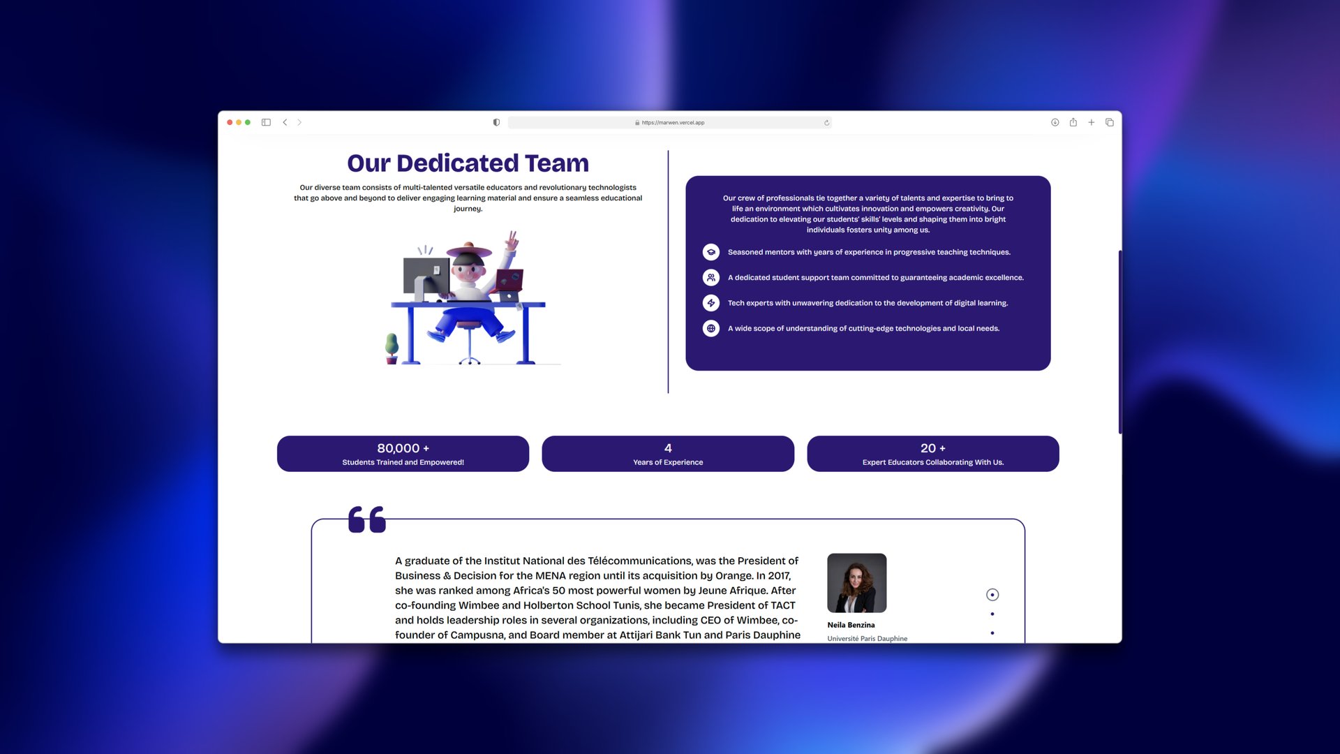
Copy, team, FAQ and chart values live in plain data that the components map over. The copy changed a lot during client reviews, and this way none of those rounds touched the layout.
Charts drawn in CSS
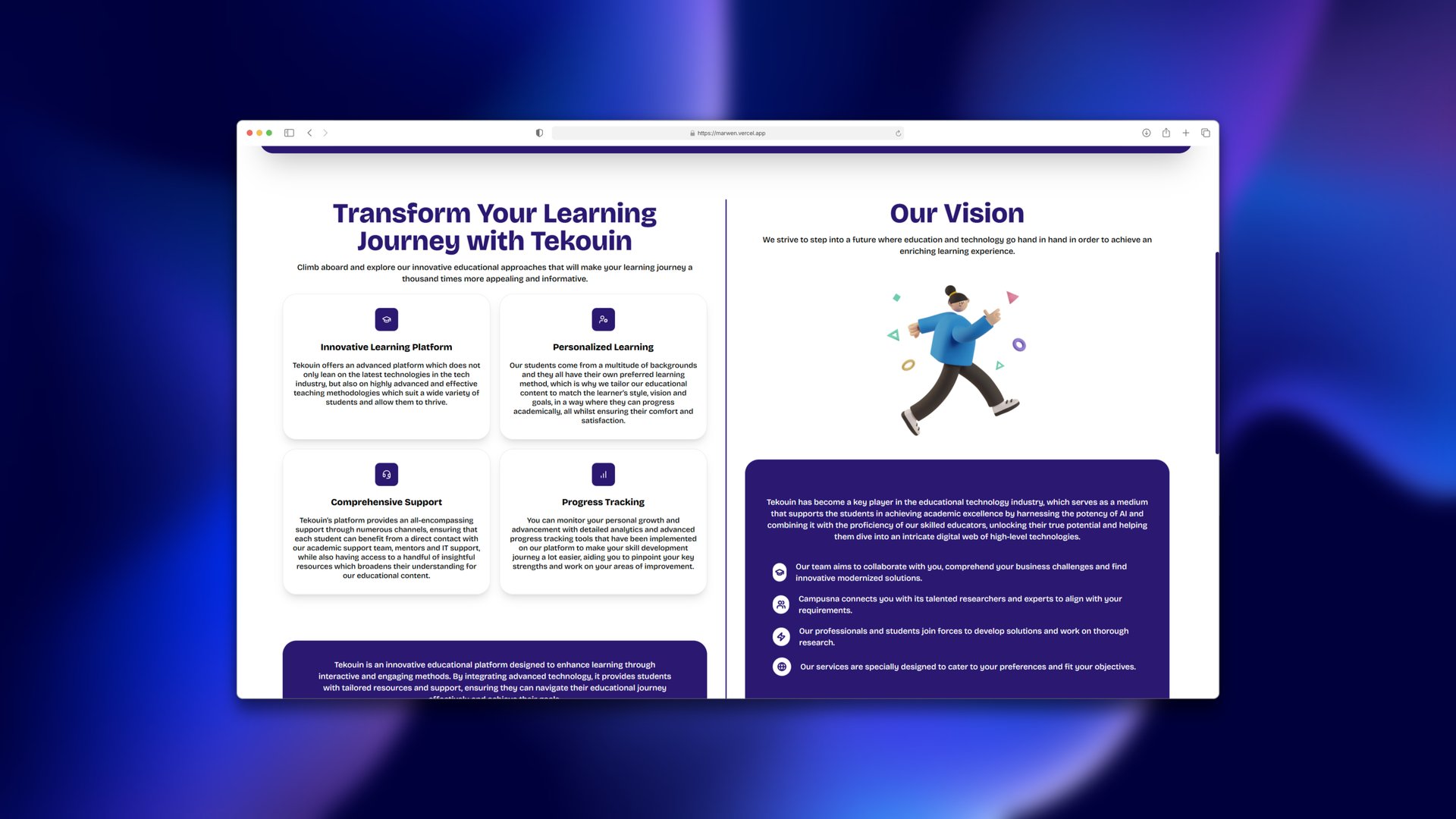
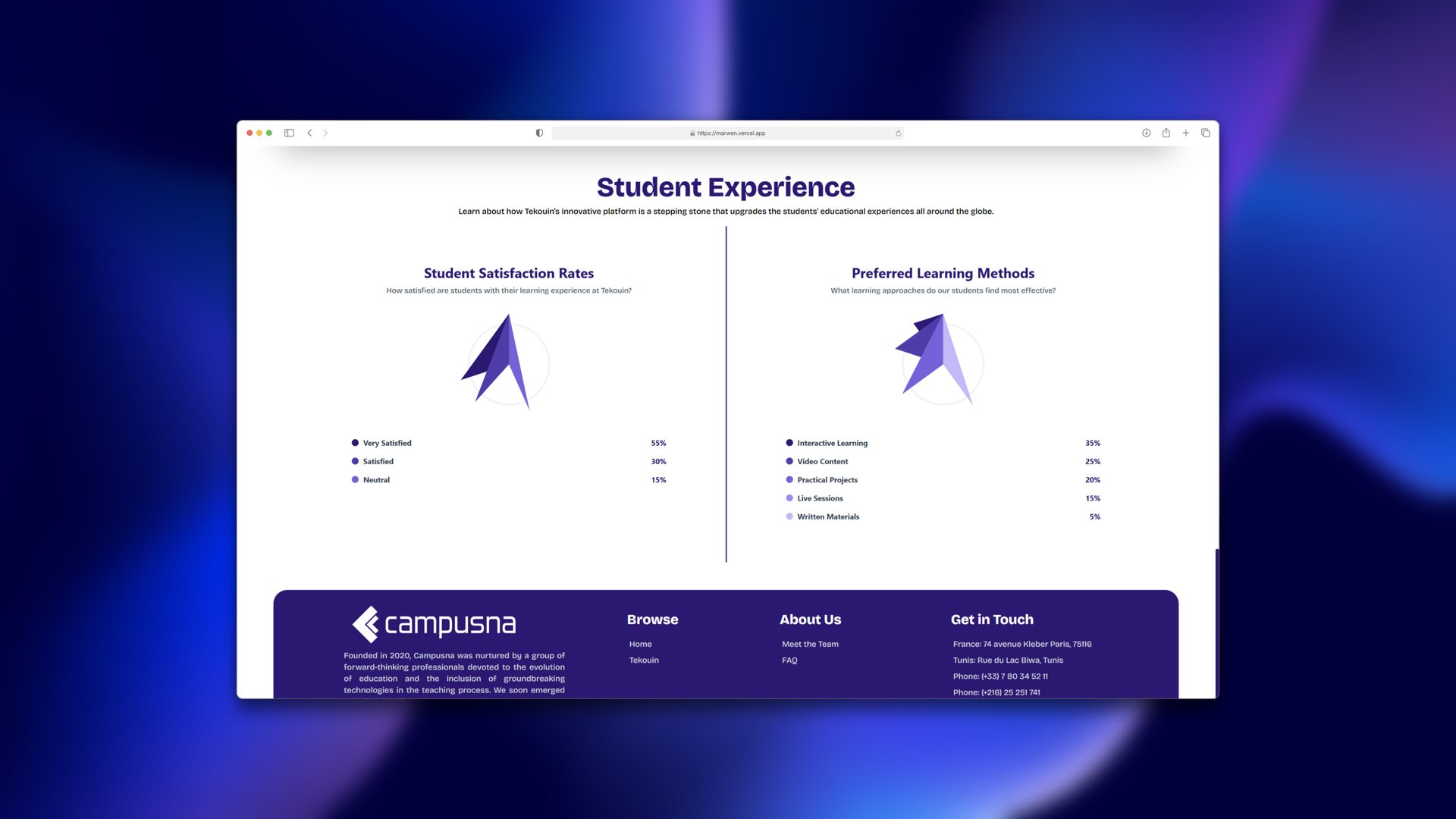
I didn't want a chart library for two small charts. Each slice is a div cut into a wedge with clip-path, with its corners calculated from its value. Slices lift on hover to show their number. The angular shapes also suit the logo better than a round pie would.
Built for phones
On phones the navigation turns into a side menu with a spring animation, and every section drops to one column. Images are lazy loaded WebP, and converting them took the hero from 237 KB to 82 KB. The site is a static export, so every page is just a file.