Deuce Studio
Oct 05, 2026
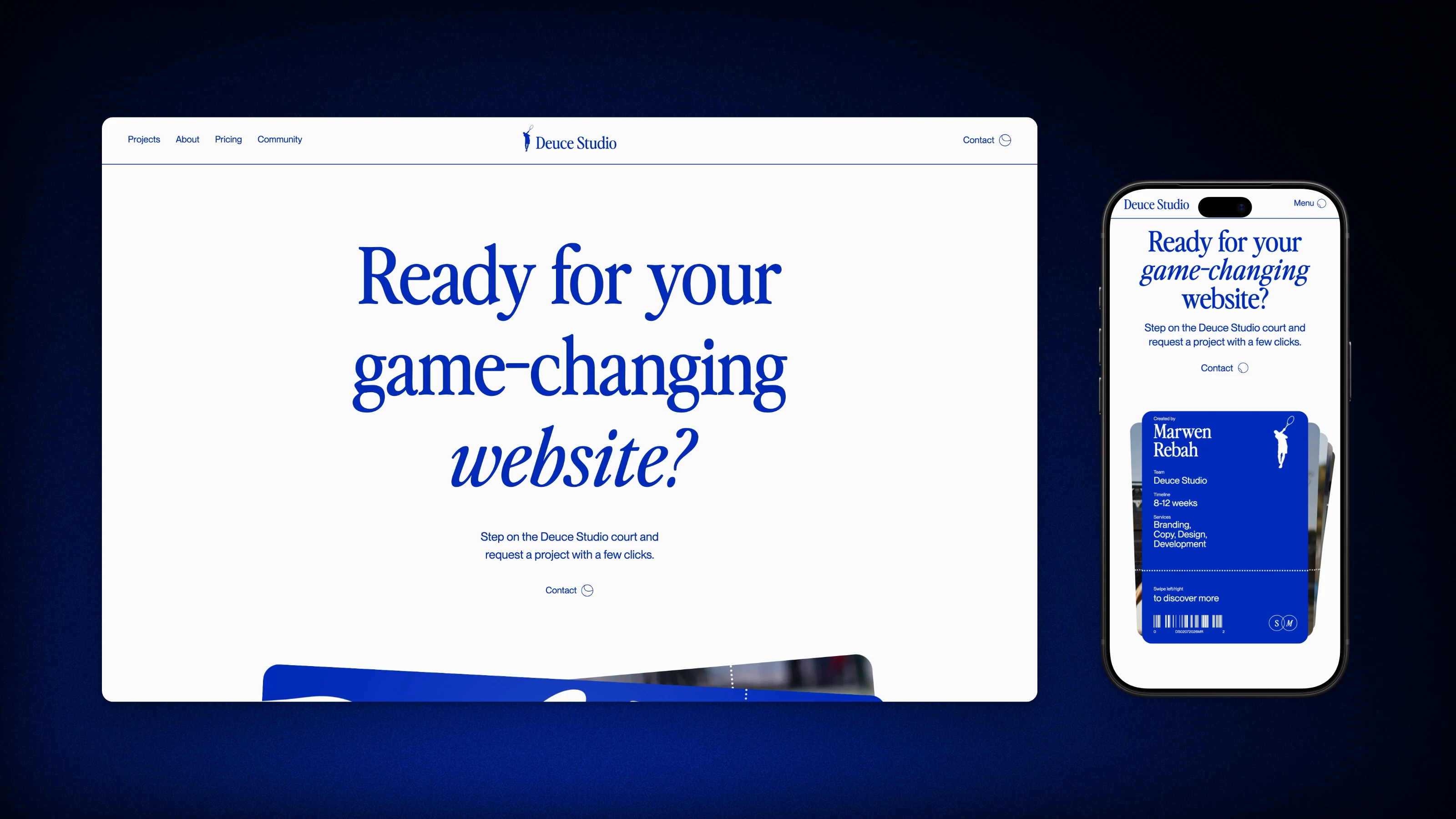
Deuce Studio is a fictional tennis-inspired design studio. I built it from scratch in Next.js after closely studying award-winning studio websites. The goal was to understand how high-end web motion is put together by rebuilding it by hand. I measured the reference instead of eyeballing it: timings match exactly, and layouts are within 1 pixel at five screen widths.
Breaking motion into pieces
I went through each animation frame by frame and wrote down what moves, in what order, for how long and on which curve. Then each sequence became its own GSAP timeline: the preloader, the navigation colour changes, magnetic buttons, scroll parallax, and the footer that's revealed as the last section scrolls away.
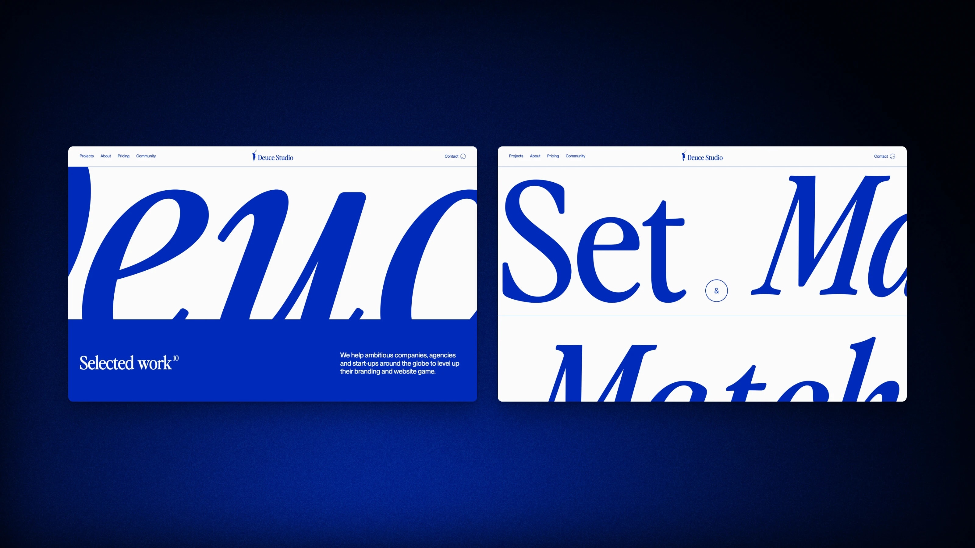
Keeping them separate meant I could pause, scrub and tweak each one alone, which is really the only way to match a reference frame for frame. The tennis court is a Lottie animation that GSAP scrubs with the scroll. The About section is three screens tall, and the court's mask grows to four times its size as you go through it. Buttons lean toward your cursor and the ticket tilts with it.
Text and lines in motion
Headings reveal line by line, hairlines grow across the page and links roll their letters on hover. Each effect is a small React component built on GSAP SplitText and ScrollTrigger, so the whole site shares one motion language.
The navigation blends its colour between sections instead of snapping. A few effects relied on older SplitText and Swiper behaviour that has since changed, so I rebuilt that behaviour by hand.
Keeping scroll effects precise
Splitting text into lines and loading Lottie graphics both shift the layout after the page has been measured. The result was scroll effects firing about 30 pixels early.
Refreshing ScrollTrigger after every shift fixed it but was slow. So I queue a single refresh for the next frame, and however many shifts happen, they cost one measurement. A breakpoint bug turned up the same way: at exactly 767 and 768 pixels the layouts disagreed until both used the same edge. The looping sliders were tuned by hand to behave the same on every screen size.
A brand of its own
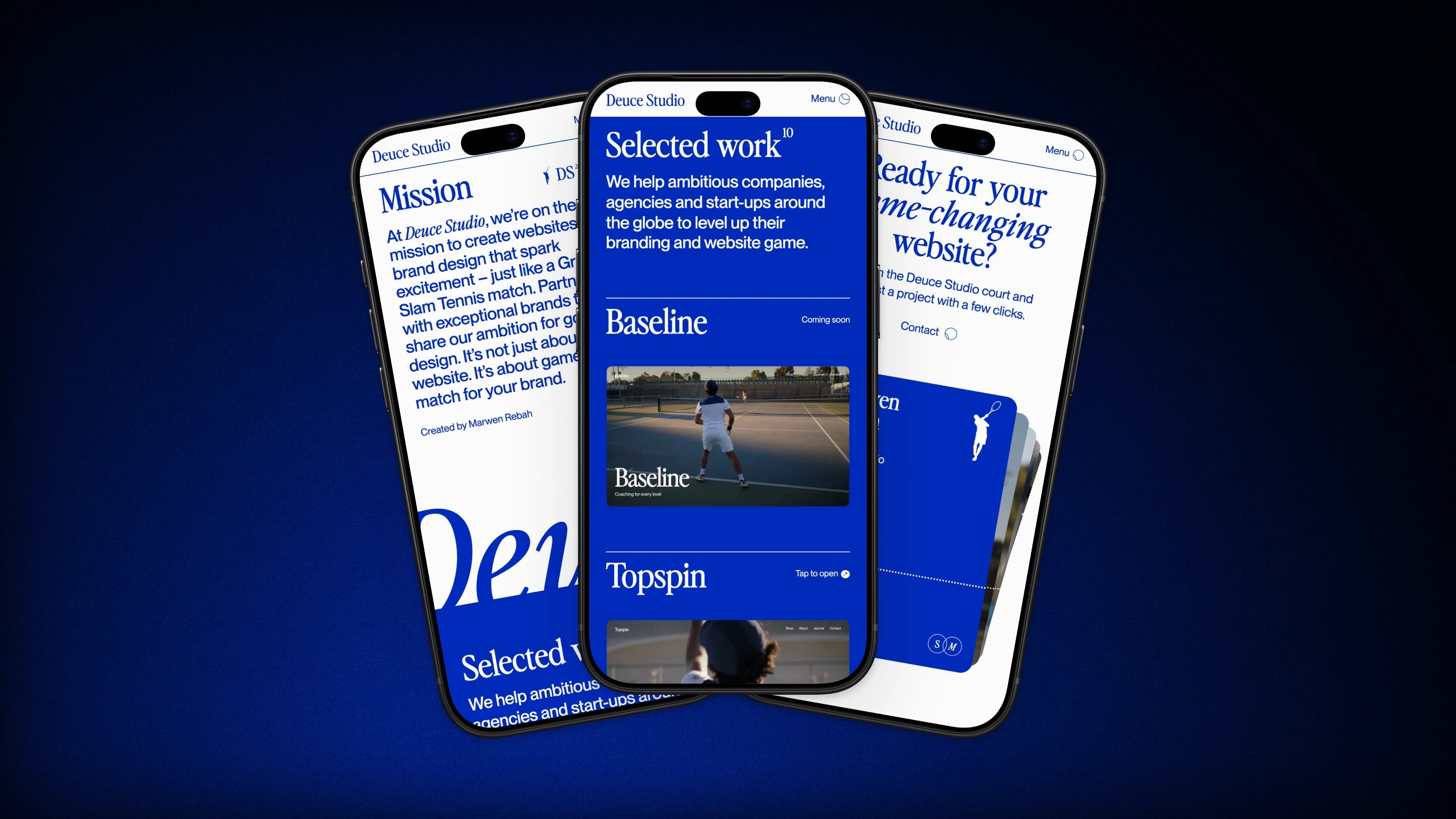
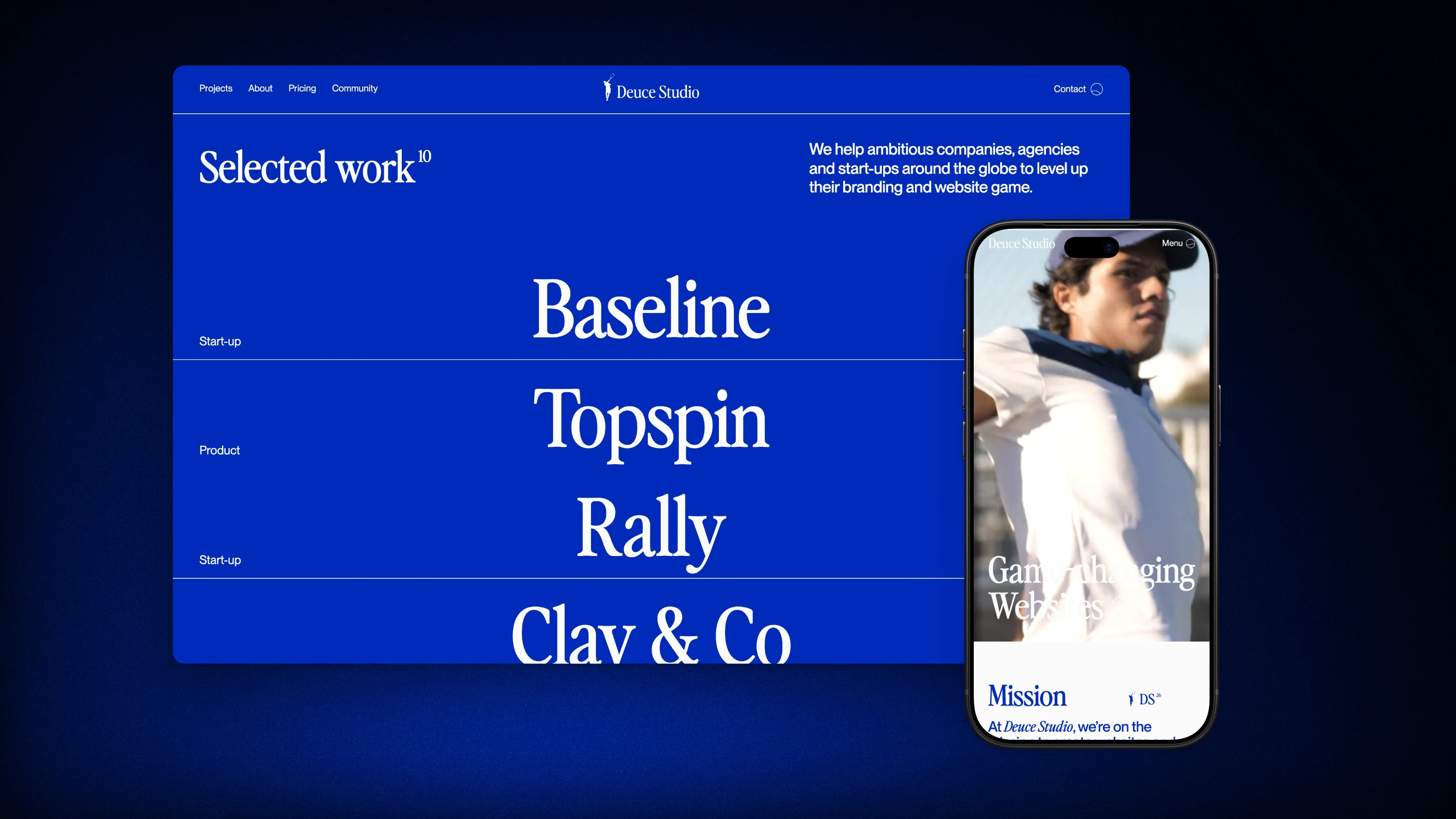
The studio has its own name, wordmark and voice, tennis footage for the hero and project covers, and ten fictional clients, from Baseline to Topspin and Rally, each with its own website cover. Making it fictional meant I could design every detail myself.
Built to production standards
The project runs Biome, knip and tsr for code checks, Vitest for unit tests, Playwright with Axe for accessibility, and Lighthouse CI for performance.