Greyscale
Oct 02, 2026
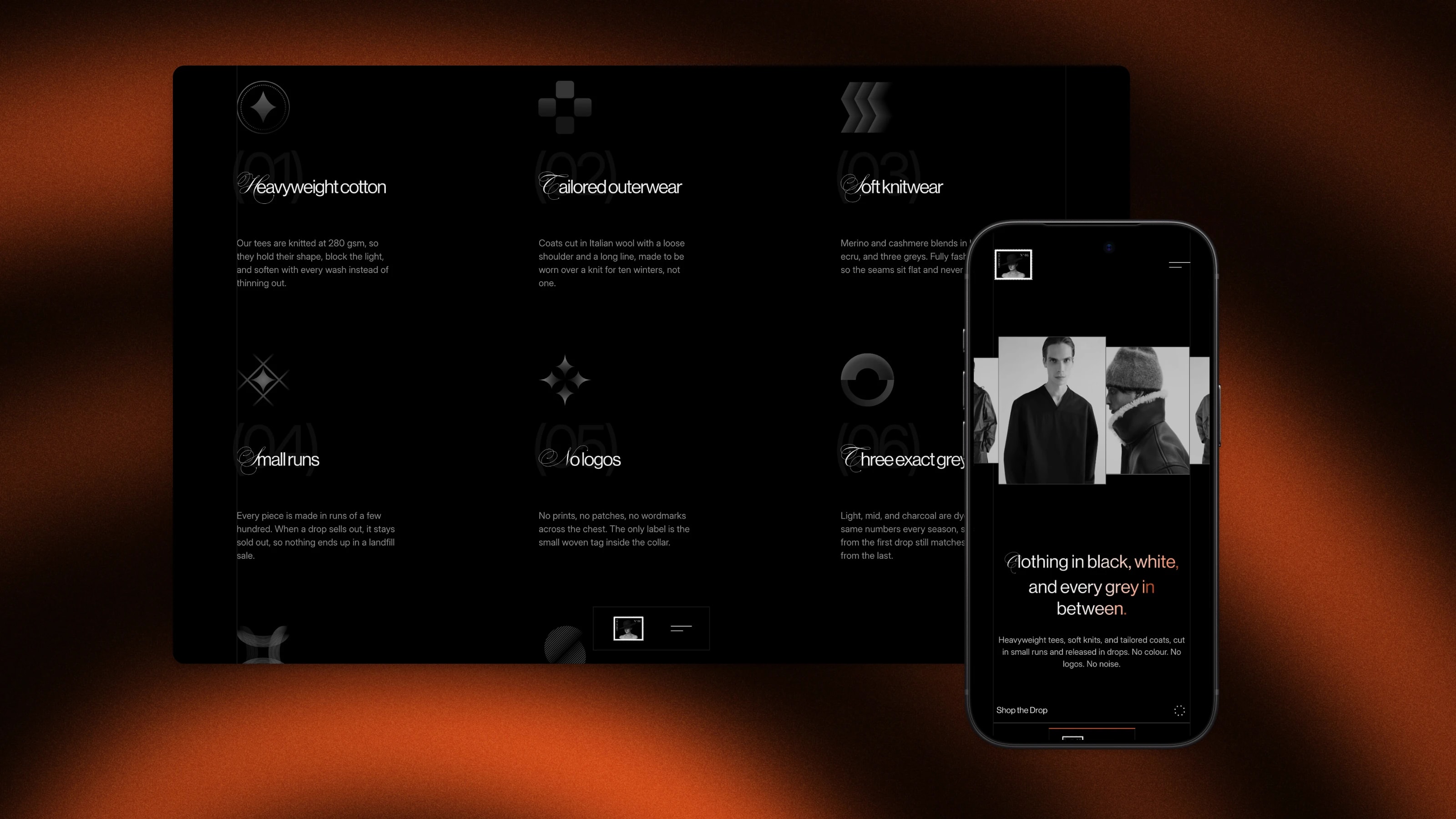
Greyscale is a fictional clothing label that only makes clothes in black, white and three greys. The site grew out of my own portfolio's motion: a glitch preloader, scrambling headings, a draggable wave of cards and an ASCII footer. I kept every effect, gave each one a reason to be there, and let the look of the site decide what kind of brand it should be.
A brand drawn from the motion
Glitches and scanlines read as signal and noise, so the brand became about removing noise: no colour, no logos, no prints. There's exactly one colour, a signal orange (#ff5a1f), and it only shows up where something can be clicked: hovers, glows and glitch layers. You learn how the page works from the colour alone. Photos sit in black and white at 80% brightness until you hover them, and that lift is the signal coming through.
A wave of 24 looks
The hero is a strip of 24 portrait cards laid along a sine wave. Each card's size, height and stacking all come from its distance to the centre, through one formula. Dragging, coasting and looping all read the same number, so they can't disagree. On desktop it drags with pointer events, estimates your speed and coasts on friction after you let go.
I measured the intro frame by frame. The cards flash in one at a time, 40 ms apart, then the strip slides in from past the edge on an exponential ease over 2.2 seconds. Images are decoded before it starts so nothing freezes halfway through. The headline scrambles through random glyphs and settles left to right, one line at a time.
Glitch as the house style
One glitch recipe runs through the whole site, in plain CSS. The image is stacked three times, one copy tinted orange and one bright grey, plus a layer of scanlines, all cut into thin bands with clip-path and pushed sideways in hard steps. No canvas, no library, and it works on any image. Each collection card plays its own slideshow on hover, with every new photo arriving through the glitch.
Light that follows the cursor
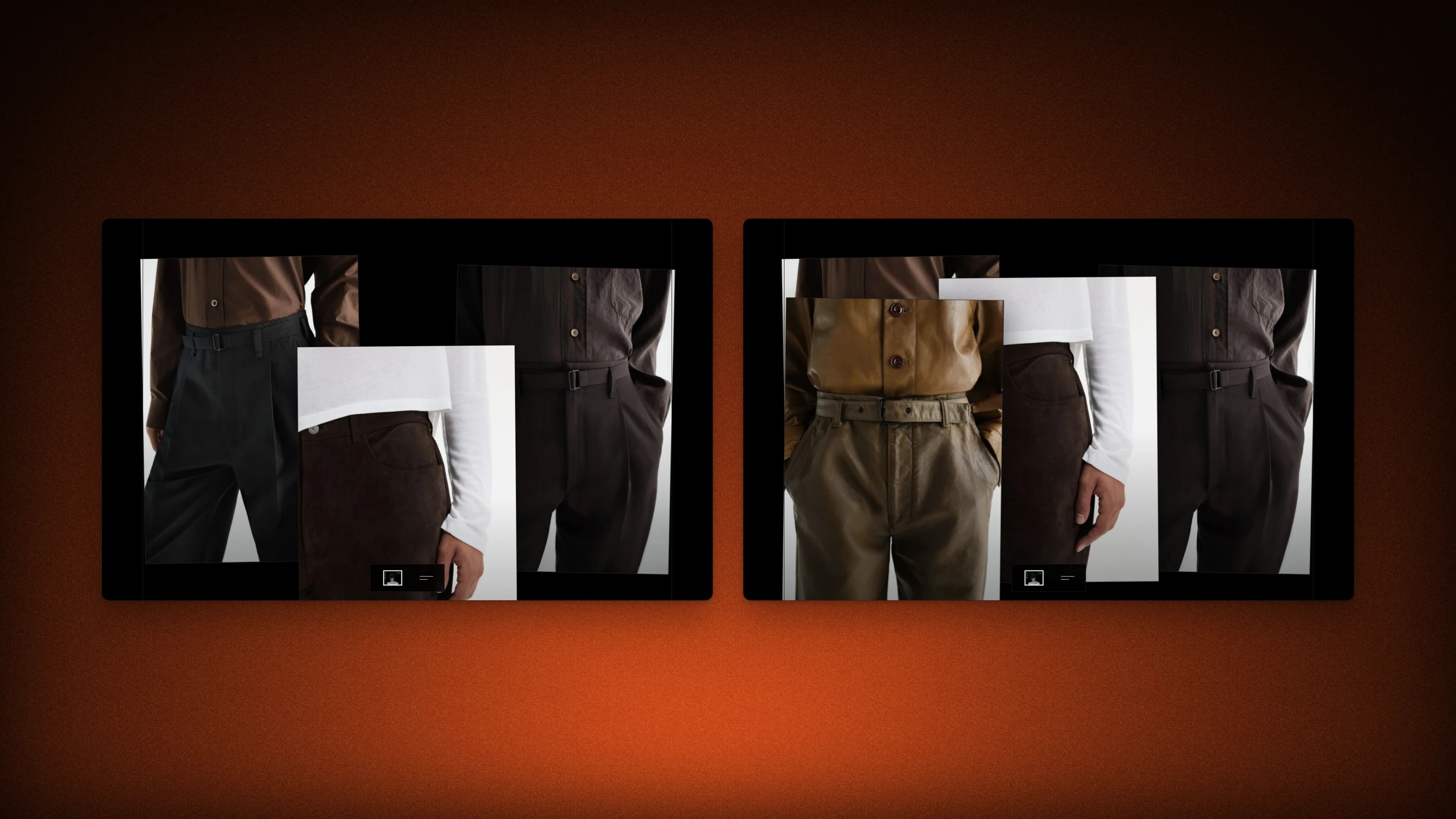
Thin guide lines run down every page, and an orange glow slides along the nearest one as you move the pointer. The same glow lights up the card edges. At the bottom, campaign photos pile up as you scroll, over a canvas that draws the brand name as a layered ASCII sculpture that shifts with the mouse.
Built for phones too
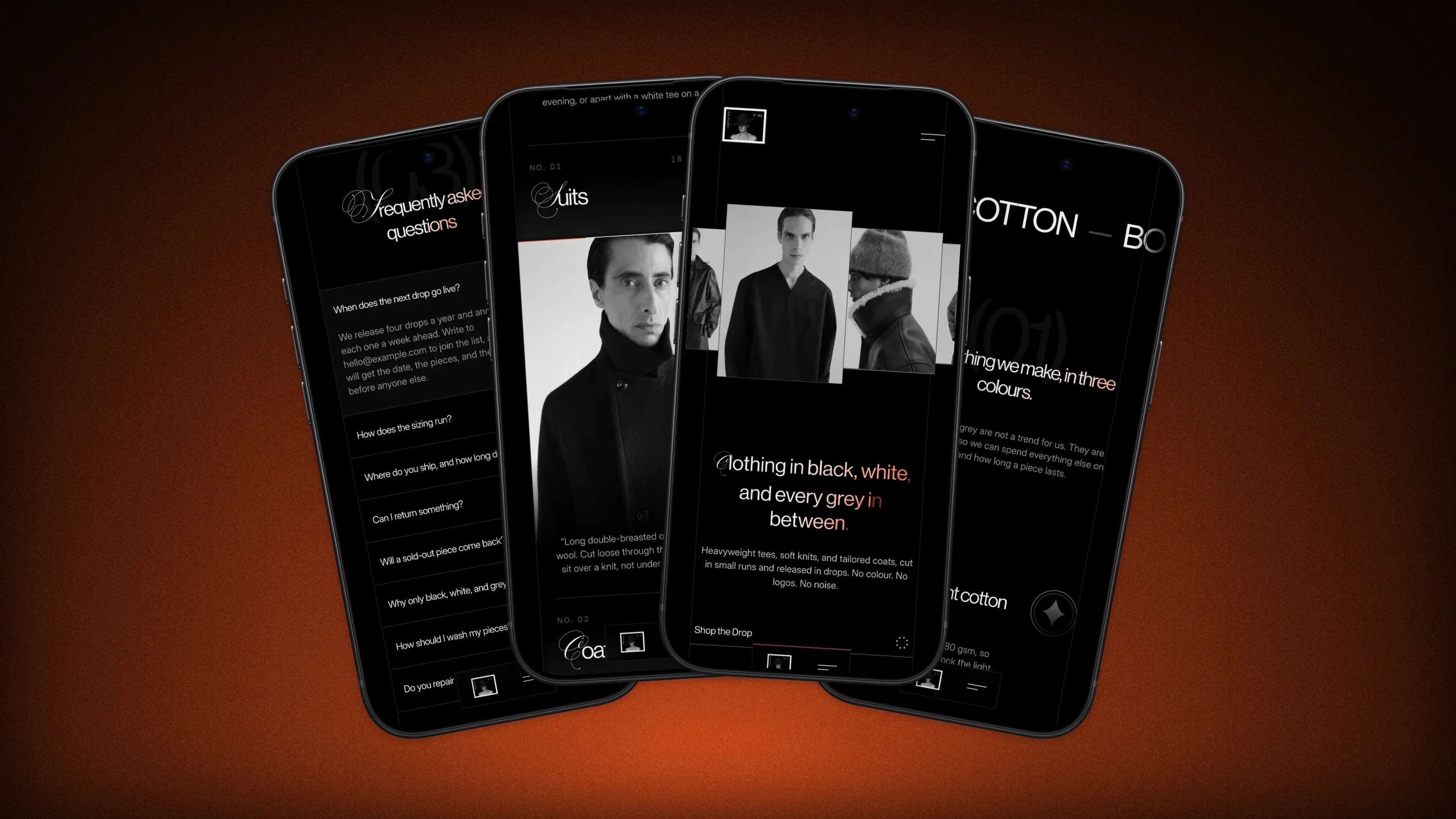
On phones the hero becomes a looping carousel that scales each slide by its distance from the centre. There's no hover on touch, so the collection card that's most visible plays its slideshow on its own.
Keeping the motion smooth
I tested everything with the CPU slowed down four times. The worst frame gap on phones was 683 ms, which is a visible freeze, and on desktop it was 367 ms. Both are under 120 ms now. Style recalculations went from 1,978 to 190 every two seconds, and main thread time from 2.03 s to 1.37 s.
The fixes weren't clever. Most of it was no longer measuring every card on every frame and giving things fixed heights. Off-screen cards are skipped, images are decoded before the intro, and the ASCII footer builds its layers in small idle slices instead of one long task. A Playwright test now fails if a frame takes too long at 4× slowdown, so it stays that way.
Every animation has a reduced motion fallback. The project runs Biome, knip and tsr for code checks, Vitest for unit tests, Playwright with Axe for accessibility, and Lighthouse CI for performance.