Lumière & Pierre
Oct 01, 2026
Lumière & Pierre is a fictional luxury real estate agency in Tunisia. I built it from scratch in Next.js after studying award-winning property websites, mostly how their type, layout and transitions work together. The brand, copy, photo selection and code are mine.
Choreographing every transition
I broke every transition down frame by frame, from the loader and the collection picker to the back button and the next collection banner. Then I rebuilt each one as a sequence of small timed steps I could tune separately. That also made bugs easier to track down. Lenis, for example, needs a resize after every transition, or the page keeps scrolling with the old height.
One unit for every size
Every size on the site is a multiple of one CSS variable, a viewport unit times a layout scale. It's set before the page hydrates, so the very first frame already has the right sizes and nothing jumps when the scripts kick in. Phones, tablets and short desktop screens each get their own scale, so all three layouts come from the same numbers.
Four collections, four colours
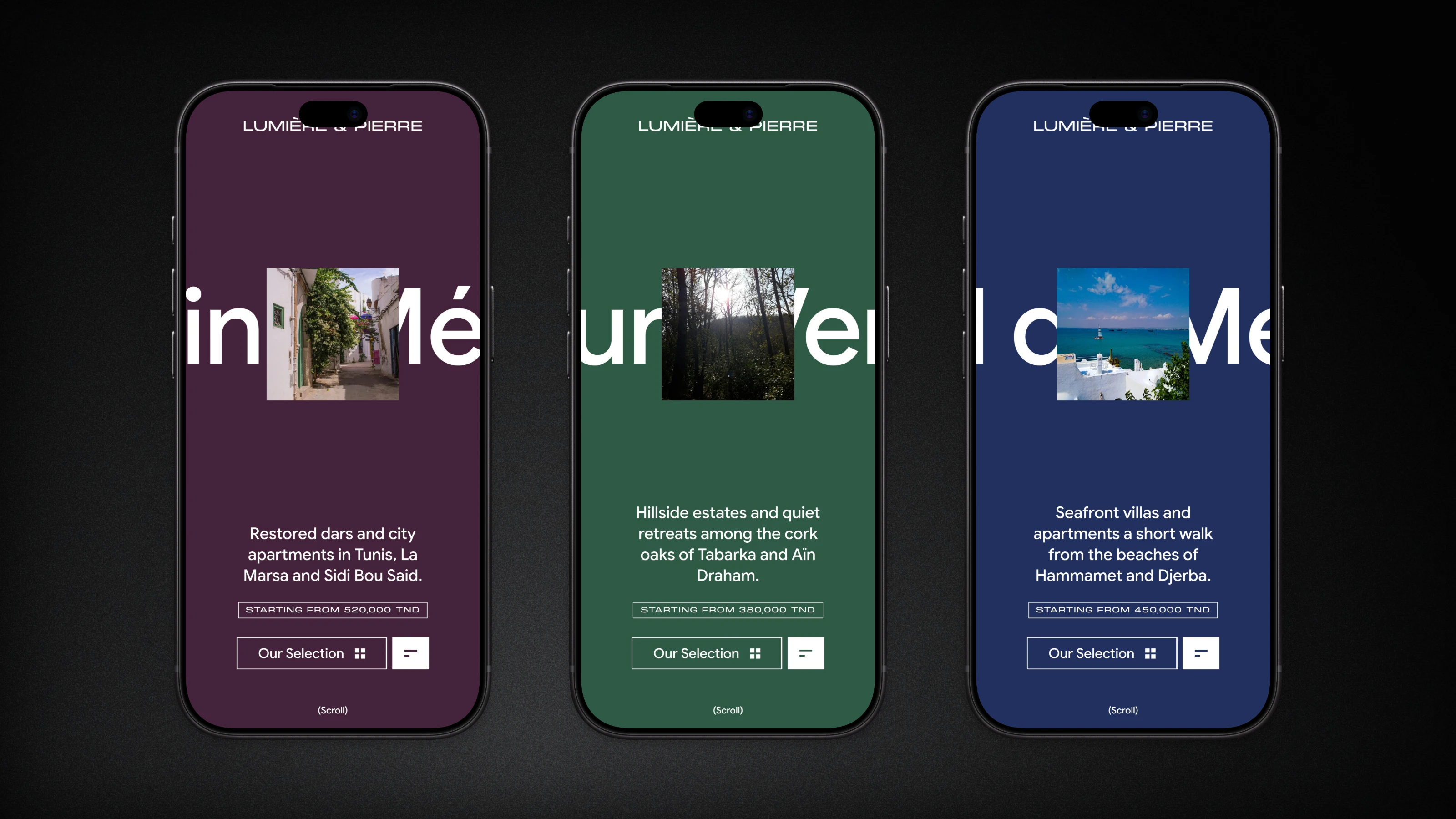
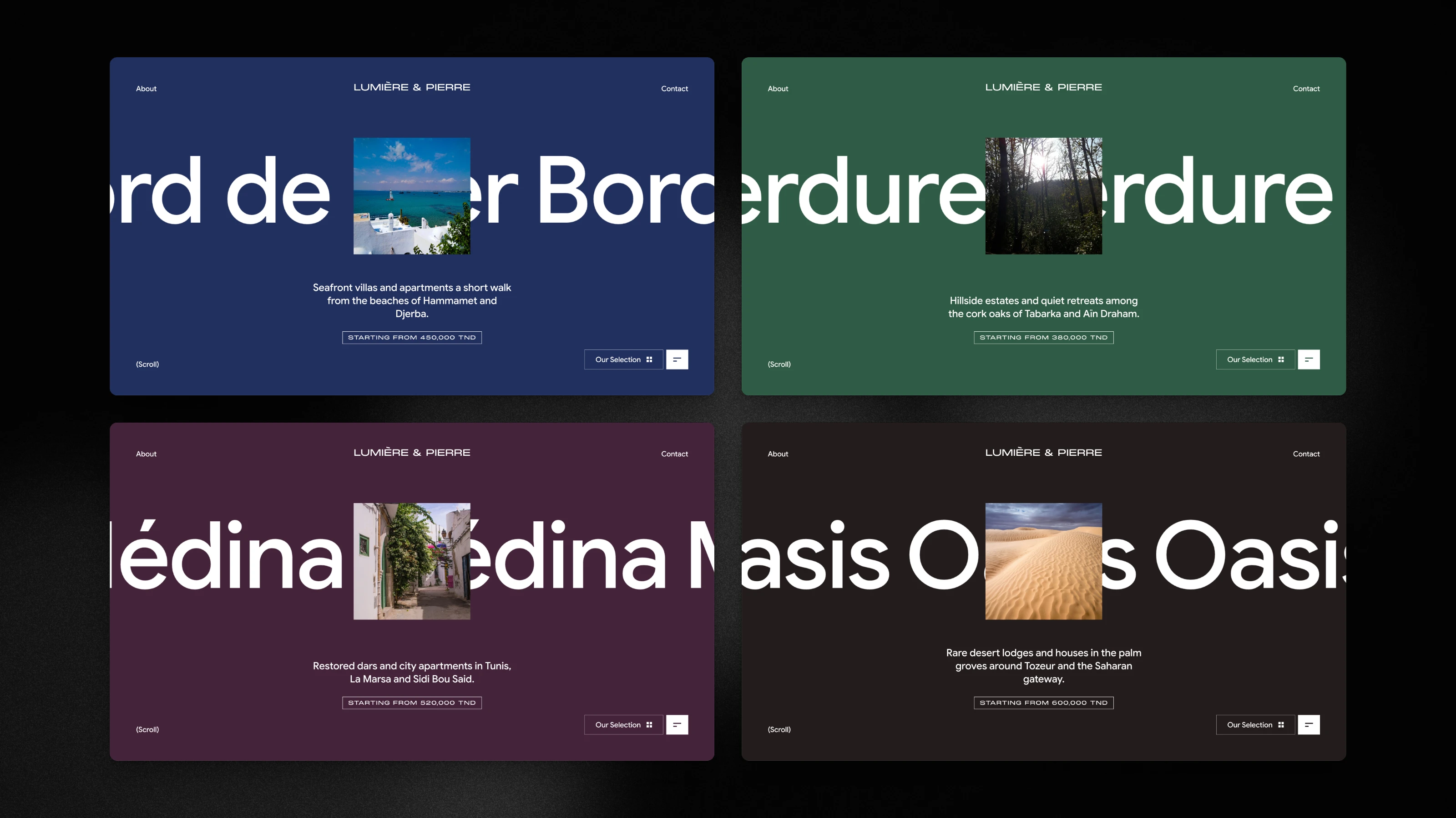
Homes come in four collections, from the coast of Hammamet to the oasis of Tozeur, each with its own colour. All the content lives in one typed file and each collection page is generated from it. Adding a collection is one new entry, and if a colour or photo is missing the build catches it.
Loader, selection and page transitions
A rolling counter runs while four photos open one after another, and the last photo becomes the hero itself. Nothing gets swapped at the end. It uses FLIP: I measure where the photo starts and where it ends, and only animate the difference, so it's the same element all the way through.
Opening the picker shrinks the page into a preview under four collection cards. Pick one and it floods with that collection's colour and grows into the new page. Other links, and the browser's back button, slide the new page over a darkened copy of the old one. The back button listens for popstate in the capture phase, so the slide starts before the router changes the page.
Scrolling through a collection
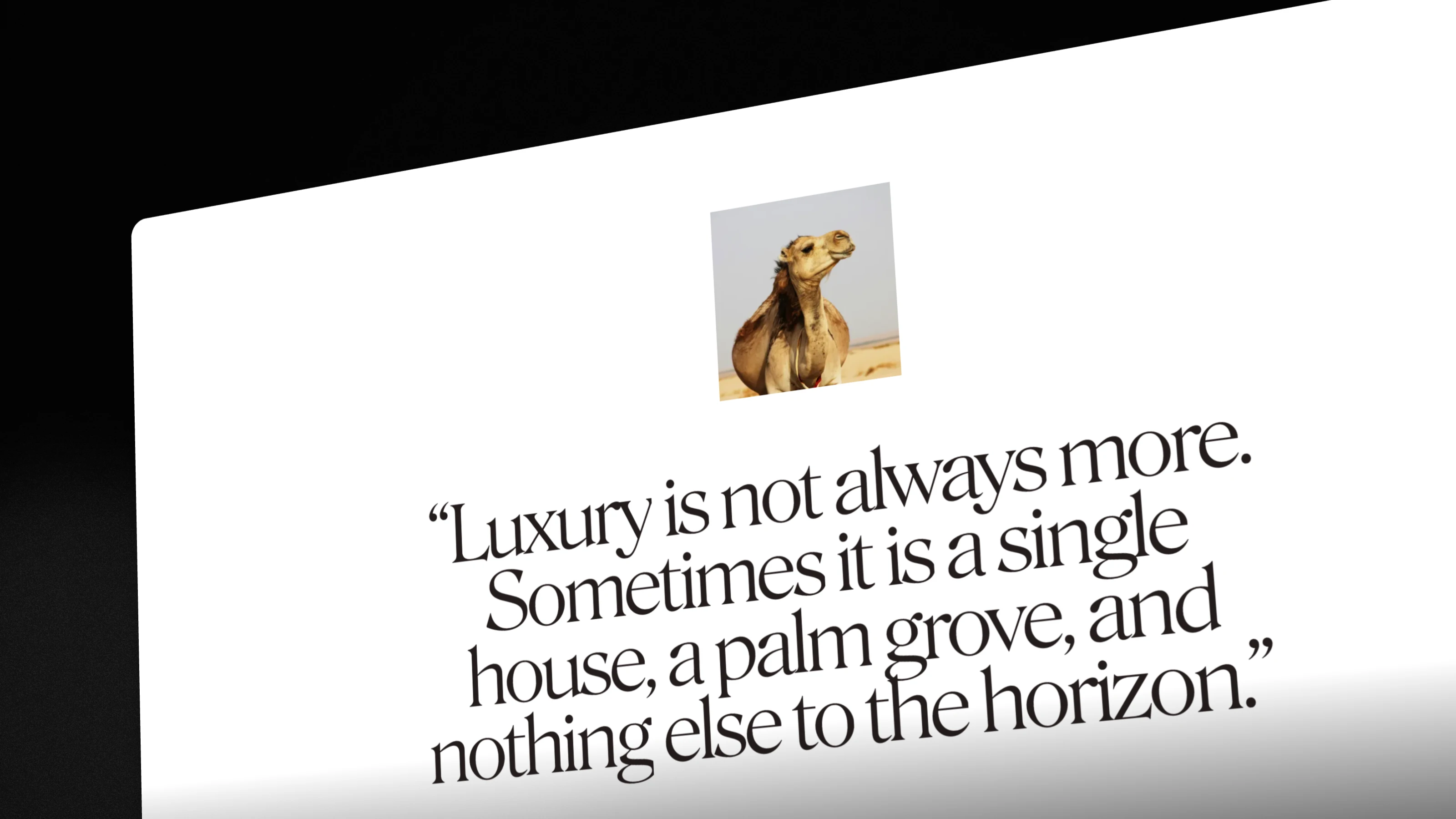
On a collection page, the hero photo grows to fill the screen as you scroll through a stage 344% of the screen tall, and the gallery moves diagonally. Quotes and photos reveal on the way down, and paragraphs rise one line at a time. I group the word masks into lines instead of animating each word, so it reads like text being uncovered. The page ends on a banner whose photo flies into the next collection's hero.
Accessible motion
Every animation respects reduced motion, decorative copies are hidden from screen readers, and the menu manages focus. Photos go through Unsplash's own image service instead of the Next.js optimiser, which kept timing out on the large originals. The project runs Biome, knip and tsr for code checks, Vitest for unit tests, Playwright with Axe for accessibility, and Lighthouse CI for performance.